
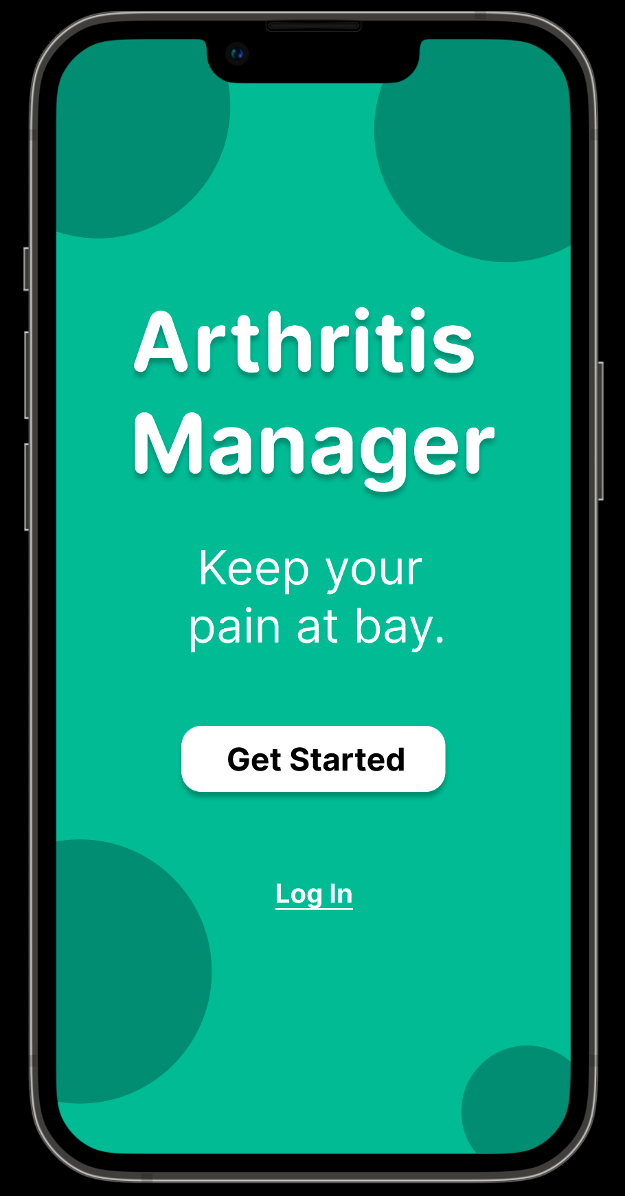
Figure 1:
Title Screen of my Masters Project UI Prototype, "Arthritis Manager"
Overview
For my graduate school program's Masters Project, we were allowed to tackle any topic we wanted, as long as we produced a tangible deliverable to show at the end. For my project, I talked to several people with arthritis-based conditions and what it was like living with said conditions every day. After much research and deliberation, I created a smartphone app prototype for them to test out in Figma. The major parts of the development process are listed below.
Part 1: Literature Review
In order to compile a solid foundation of knowledge on past attempts at helping patients with treating their arthritis, I conducted a literature review on sites like Google Scholar. With this procedure, I attempted to deduce potential gaps in the literature and pain points in existing methods and products that I could focus on for my own prototype. I focused on issues with both current arthritis treatment procedures, with or without smartphone applications, and issues with existing smartphone apps themselves.
Part 2: Online Survey
To start off my information gathering process from outside users, I created an online survey via Georgia Tech Qualtrics and distributed it to several subreddits on Reddit dedicated to arthritis. The ones I focused on were r/rheumatoid, r/Thritis, r/gout, and r/ankylosingspondylitis. However, these subreddits had rules in place that prohibited surveys from being posted without moderator approval ahead of time. As a result, I had to private message the moderators of each subreddit explaining my project and intentions to them before they gave their approval. After each subreddit’s moderators approved my survey, I was able to post my survey to all those subreddits with those same moderators leaving specially marked comments on those posts to indicate their approval (Figure 2). Those comments must have convinced regular users of those subreddits that the survey was legitimate, as I started getting many answers to my survey soon afterwards. I ended up with well over 90 responses by the end of the semester (Figure 3).
The final two survey questions, those being “are you interested in doing a user interview?” and “if you are, please leave your email address in the box below” had 27 out of 54 positive responses, indicating that 27 people wanted to conduct a further user interview with me. I got 27 email addresses in my survey’s final question as a result. I sent emails to all of those addresses requesting to schedule time for a remote interview via MS Teams with them. I got 5 responses back, so I set up 5 different interviews with those people, as well as a 6th interview with another Georgia Tech student.
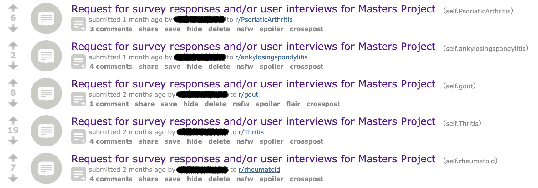
Figure 2 - the list of Reddit posts I made for my survey
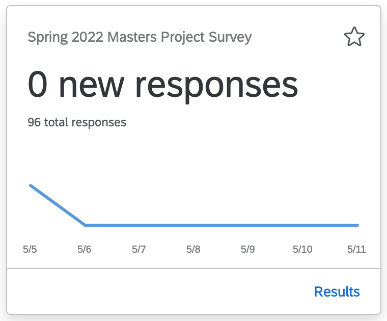
Figure 3 - Total number of survey responses as of 5/11/2022
Part 3: Interviews
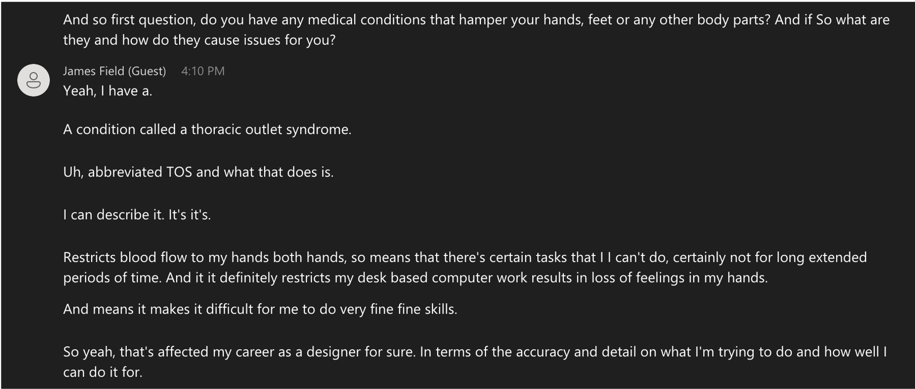
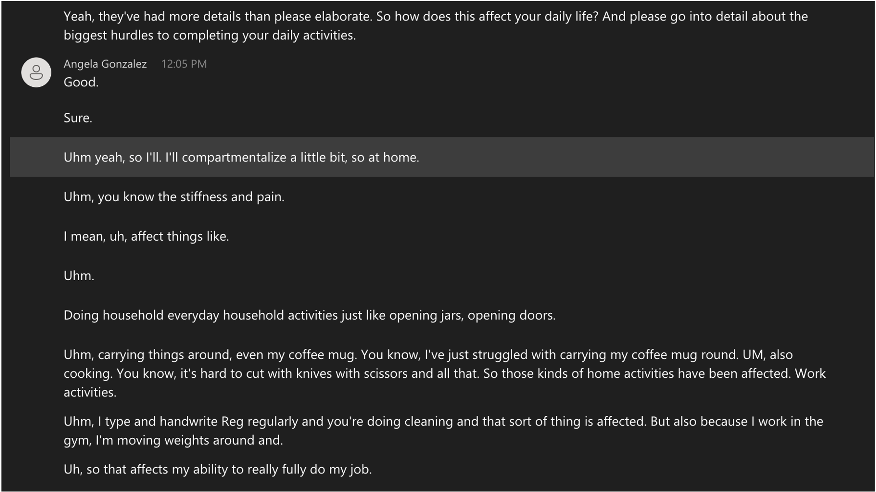
After scheduling each interview and before the interviews actually happened, I sent a consent form for them to sign to indicate their approval of participating in the study (included in the Appendix). All the user interviews were remote semi-structured interviews on MS Teams with recordings and transcripts to refer back to for the affinity diagrams, personas, and journey maps in my investigation process. Each interview took 60 to 90 minutes to complete, and I asked each person the same list of pre-written questions (included in the Appendix) along with some extra unscripted questions depending on each interviewee’s answers. I interviewed five females and one male; that one male was a working employee, and so were four of the five females. The last one was a Georgia Tech student in another of my classes.
Overall, the questions I asked each interviewee gave me a lot of valuable information that heavily informed my design requirements for my final prototype. I took as many notes as I could from each interview pertaining to the questions I asked them, the pain points they encountered in their daily lives, and potential gaps in current design choices that I could address in my prototype.
Part 4: Affinity Diagram
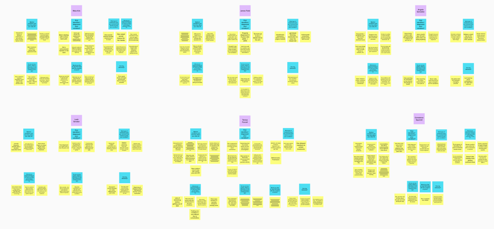
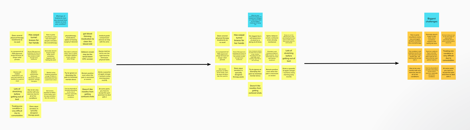
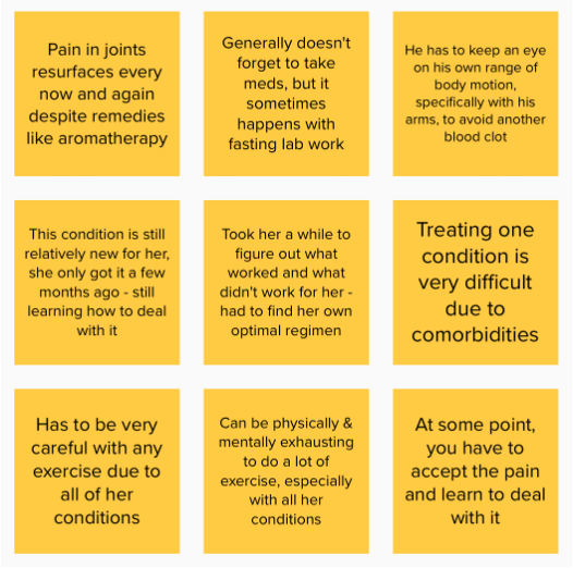
I wrote all of my notes in an affinity diagram on mural.com (Figure 8, Link here) and narrowed them down to nine key notes that I used to deduce 4 major takeaways for my prototype design requirements (Figure 9).
These nine notes are what I considered to be the major common points across all the interviews and the most useful information for my design requirements.
In general, the four most important takeaways I got from this diagram are: 1) When it comes to arthritis, people’s bodies work against them and they don’t know how to deal with it at first, 2) patients need to endure the pain on an ongoing basis because it’s most likely a chronic condition, 3) they need an optimal treatment regimen that is continuously updated as they figure out how to best treat their diseases, and 4) they must find patterns to their symptoms to identify and diagnose diseases as quickly as possible.
Part 5-1: Personas
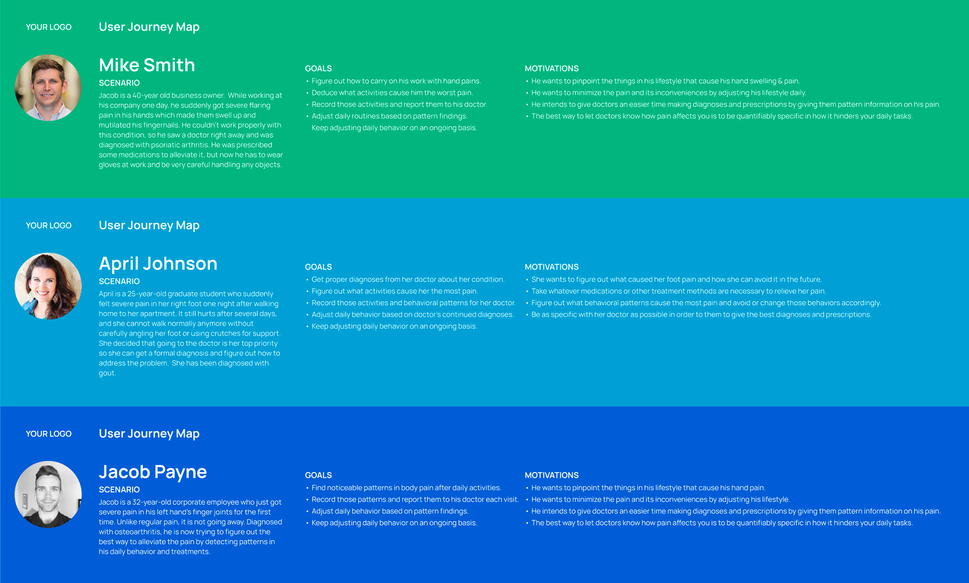
After deducing my four key takeaways from my affinity diagram, I created three different personas based on the people I interviewed (Figure 10). While they have different names, ages and occupations, they have a few key points in common. They all suddenly get severe pain and various other symptoms in a part of their bodies that doesn’t go away overnight, and they have to go see the doctor immediately to get a formal diagnosis and an official care routine.
Each of their goals and motivations are fundamentally very similar. In terms of goals, they all want to get proper diagnoses from their doctors about their conditions, they want to figure out what activities they do every day that cause them the most pain and adjust their routines accordingly, they want to record their daily activities and the symptoms they feel, and give that data to their doctors for new prescriptions or other recommendations. Regarding their motivations, their primary one is the minimize the pain they feel on an ongoing basis (since their conditions are most likely chronic), whether that be through adjusting their own daily routines or giving their recorded data to their doctors. In any case, they would mostly want to pinpoint what actions or tasks they perform each day that cause the most pain and figure out ways to avoid doing those actions so that they do not cause themselves any extra suffering.
Part 5-2: Journey Map
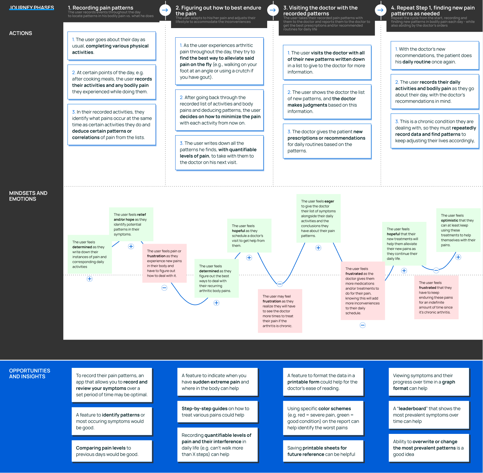
At the same time as the personas, I also constructed a journey map (Figure 12) of the end users’ general process as they go about their lives and monitor and record their symptoms. This map has four major phases that outline the steps of recording their pain symptoms and figuring out how to adjust their routines accordingly. Phase one involves the users recording their pain levels and patterns throughout or at the end of a day and then deducing certain patterns from them. Phase two is when the user figures out how to best endure the pain on the spot if they experience sudden flare-ups or other sharp pains, as well as deciding how to best minimize the pain and quantifying how it affects their ability to do tasks. Phase three involves scheduling a doctor’s visit and showing the doctor the sheets of recorded data so the doctor can make well-informed judgments and recommendations to the patient based on said data. Phase four is repeating Phase 1, but using the doctor’s new recommendations as they go about their day and experience new pains. This is a cyclical process that will keep going for a long time, mostly because arthritis conditions in general are chronic.
The bottom half of the journey map in Figure 12 shows the emotional journey the end user goes through, which has both highs and lows. The lows consist mostly of frustration and pain as they attempt to figure out the new symptoms they experience and how to best deal with them, while the highs consist of relief, determination, and hope that things will get better if they keep doing their care routines. Ideally, the end user would not have to go through this process at all in the first place because they don’t have those conditions, but arthritis can happen to anyone for any reason, whether the body’s own immune system mistakenly attacks itself (e.g. rheumatoid arthritis) or if the user wears their joints down physically (e.g. osteoarthritis).
Part 6: Prototype Design Requirements
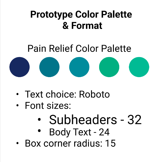
After writing up the journey map and design opportunities/insights, I made a list of general design requirements to abide by as I made my final prototype in Figma (Figure 13). This focused on the overall color scheme, font choice, and aesthetics of the buttons, as well as navigation and menu design. The font I used was Roboto in various sizes depending on where certain words were placed on the screens, and the color scheme I used involved mainly cool colors like blue and green to simulate pain relief. I also used rounded buttons with a specific corner radius to give the app the impression of being an iOS app on the App Store.
In terms of navigation, I decided that end users should be able to navigate between screens very easily with minimal finger movement, especially if they have arthritis in their hands and cannot move their fingers around without inducing pain. With that in mind, I wanted minimal scrolling in my app, and most navigation would be done through tapping buttons already on the screen. In addition, I wanted each section of the app in the bottom menu bar to have a clearly defined purpose and layout so users could swap back and forth between them very easily at any time. I also wanted said bottom menu bar to remain consistent throughout the entire app no matter what section the user was in, with the only changing element being the highlighted section to indicate where in the app the user currently was. Lastly, as mentioned before, I chose a color scheme of predominantly green and blue to give off an aura of pain relief. I believed that this would subconsciously let the user feel more emotionally comfortable as they were using the app, which one user did confirm with me after I said so in one usability testing session.
Part 7: Artifact Details
The final artifact I made for my project is a Figma smartphone app prototype. The next several figures will show all sections of the app in the order I designed them, as well as each section’s intended functionality. There are five major sections: 1) the Title Screen and a short questionnaire for new users, 2) the Main Menu and Record New Symptoms section, 3) the Review Past Recorded Symptoms section, 4) a section with Guides (both in-app and external) for how to treat specific conditions and symptoms, and 5) a section for saving printable PDFs of recorded data.
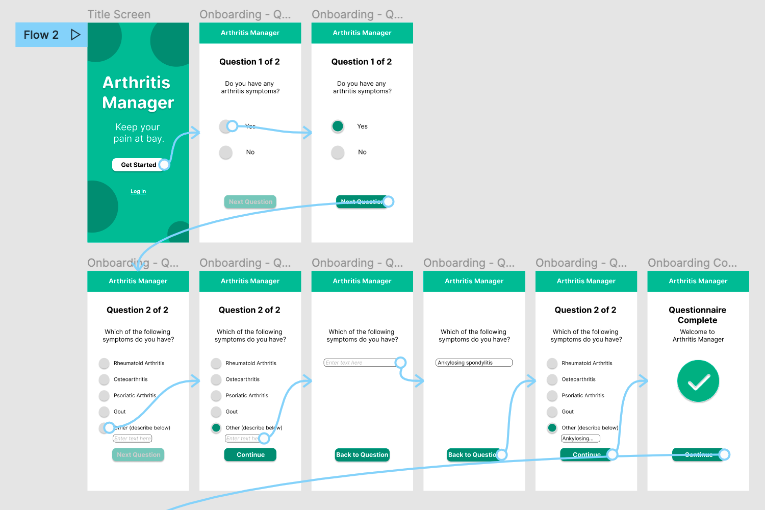
Section 1 is the Title Screen and a short questionnaire for new users (Figure 14). This is where the user starts the process of using the app. The title screen has two buttons, “Get Started” and “Log In”. If the user already has account data in the app, they would click Log In and enter their login information. If the user is new to the app, they would click “Get Started” and then move on to the short questionnaire, which consists of two multiple choice questions. The first question is simply “Do you have any arthritis symptoms?” with a Yes/No answer. The second question asks “Which of the following symptoms do you have?”, followed by 5 answer choices: Rheumatoid arthritis, Osteoarthritis, Psoriatic arthritis, Gout, and Other. If the user selects Other, they would then have to enter the specific name of the condition they have in the accompanying text box. Once both questions are answered, the user can log into the app.
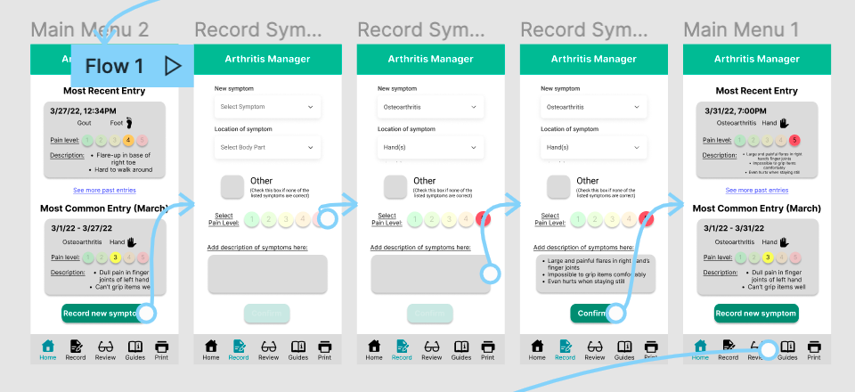
Section 2 is the Main Menu and Record New Symptoms section (Figure 15). The first and last screens shown are the main menu with different information entered in the top box. The top half shows the most recent entry the user has recorded in the New Symptoms section, and the bottom half shows the overall most common entry the user has made throughout the past month. There is also a green button leading to the Record New Symptoms section, which is what the second, third, and fourth screens show. Here, the user can enter what new condition they have for that day, as well as which body part has the condition and the numerical pain level they think it is (1 is the least painful, 5 is the most painful). There is also an “Other” checkbox if the user needs to enter a different symptom from all the ones listed in the first dropdown menu. Lastly, there is a text box at the bottom of the screen to enter details about their condition. The user can either type it in manually or use their phone’s voice dictation (e.g. Siri, Cortana) to enter more details.
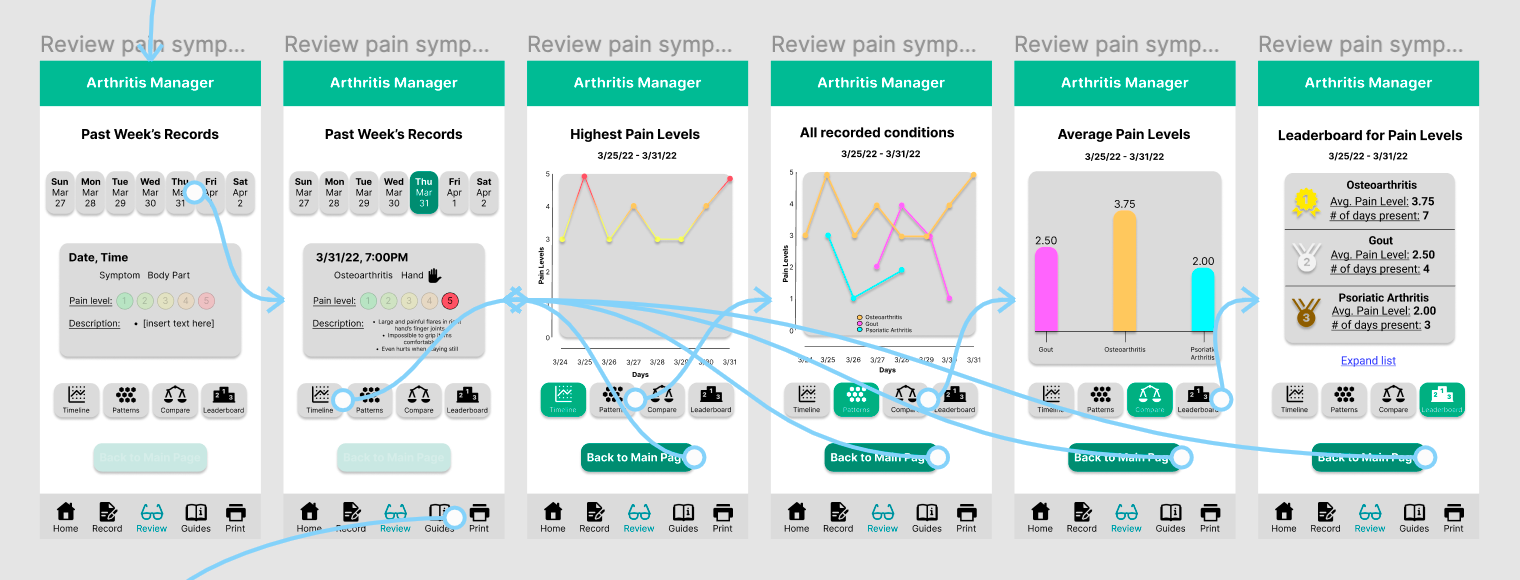
Section 3 is the Review Past Recorded Symptoms section (Figure 16, shown above). This part allows the user to review data they entered over the past week by picking one day of that week and looking at the data. It also allows the user to see various graphs about that week’s data – there are two line graphs showing the overall highest pain levels over the week and each individual condition’s pain levels over the week, a bar graph showing the average pain levels of each condition, and a leaderboard of which condition has the highest average pain level and number of days present in the user’s body. These graphs are separated by four buttons in the lower half of the screen that the user can tap one at a time to see each graph individually. The Timeline button shows the first line graph, the Patterns button shows the second line graph, the Compare button shows the bar graph, and the Leaderboard button shows the leaderboard.
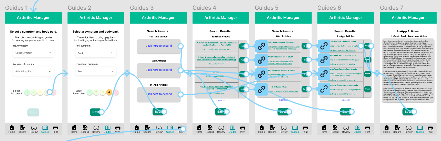
Section 4 is the In-app and External Guides section (Figure 17). In this section, the user can enter search terms like the condition they want to treat, the body part it’s currently located in, and the numerical pain level. After searching, they will get a list of search results with sections for in-app guides, YouTube videos, and external web guides. The user can then click on each section to go to a separate list of search results composed only of that category of result. The external links to YouTube and web guides take the user to those videos or sites, and the in-app guides take the user to other pages within the app itself. The user also has the option to click the back button on the bottom of the screen at any time. This lets them go back to the previous screen and choose a different search results section or enter a different condition to search for information and guides about it.
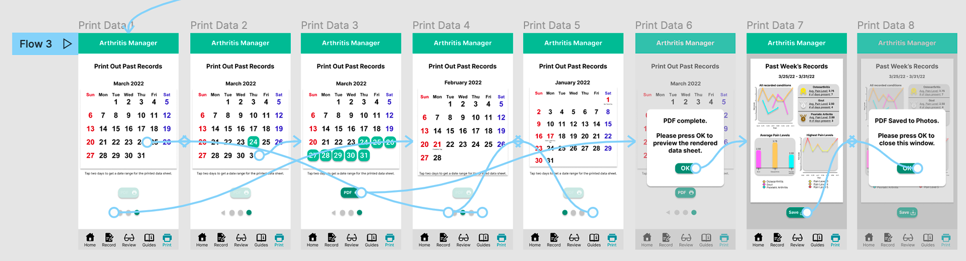
The fifth and final section (Figure 18) is dedicated to formatting past recorded data from a certain time range into a printable PDF and then doing whatever else they want with it. They can save the PDF to their files or photos, or they can share it digitally with others via text message or email. The section starts with a monthly calendar view showing the current month, as well as arrows and circles at the bottom indicating the other monthly calendars the user can scroll between. This lets the user select a date range manually by tapping two individual days on the calendars to indicate the start and end dates. For instance, if the user taps March 24th and then March 31st, the date range for the formatted data becomes March 24 – 31. After the user selects a date range, they can click the PDF button with a printer icon to generate the printable sheet. Then, they can save it digitally to their photos or files and do whatever they want with the saved file afterwards, like sharing it through email or printing it out via the phone’s native functions. These provide multiple ways of getting the data to the doctor in an easy-to-read format so the doctor can be more well-informed about the patient’s most recent symptomatic experiences.
Part 8: Usability Testing Sessions
After finishing the prototype in Figma, I decided to test it out with several potential end users, some of whom I previously interviewed. I sent emails to all six interviewees that I talked to earlier this semester asking for remote usability testing sessions via MS Teams, and I got three affirmative responses back agreeing to help me. There was a fourth affirmative response, but they never replied to me after that about when they would have time to hold the session. In order to get at least five sessions done, I posted a thread asking for help in the MS-HCI Slack Workspace. I got two students to schedule usability testing sessions with me as well, bringing my total to five. Just like with the semi-structured user interviews, all sessions were recorded and transcribed on MS Teams (but also on BlueJeans because some users were guest users on Teams and could not share their screens properly as a result).
Before each session, I sent another consent form for them to sign to indicate their approval of participating in the testing sessions (included in the Appendix). Then, during each session, I gave each participant a link to the Figma prototype in “interactive” form, meaning they could use their mouse cursors as fingers to tap on the simulated screens and navigate the interface. I also gave them a series of five tasks to complete that involved navigating the interface and a series of Likert Scale questions to answer both during and after the sessions were over. The tasks were as follows:
• Make a new account and answer the questionnaire
• Record a new symptom
• Review past recorded symptoms
• Search for guides on how to treat specific conditions
• Save a printable PDF of past data
During the tasks, I requested each person to think aloud and give me feedback on anything they thought was unusually designed or which they had trouble with regarding the navigation or user flow. After each task, I asked the same two questions on a scale of 1 to 5, which were: 1) How easy did you find the task? (5 is easiest), and 2) How quickly do you think you got it done? (5 is fastest). I wrote down each participant’s numerical answers and their qualitative feedback, and then I moved on to the next task. I gathered up all of the participants’ quantitative feedback and calculated the averages for each Likert Scale question in each task. The final bar graph for these calculations is below in Figure 19.
Part 9: Likert Scale Questions
After all five tasks were finished and the session was done, I then sent each user a set of extra Likert Scale questions, also on scales of 1-5, for them to answer on their own time, and they emailed me their answers. I took all of their answers from these questions and graphed their numerical averages in their own separate bar graph, shown in Figure 20.
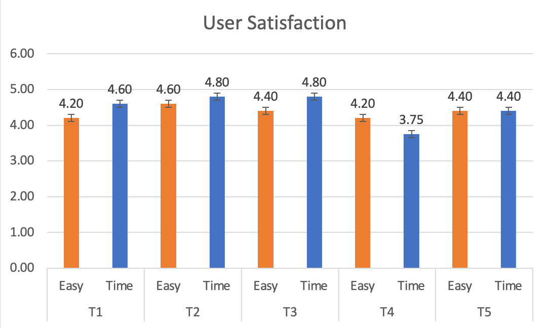
The above bar graph shows the overall numerical averages of the two Likert Scale questions I asked after each task: How easy was the task, and How quickly did you finish the task? All of the numerical averages were between 4 and 5 (except for the Time question in Task 4), indicating the UI is quick and easy to navigate. Task 4 was navigating the Guides section, indicating that section needs the most revisions.
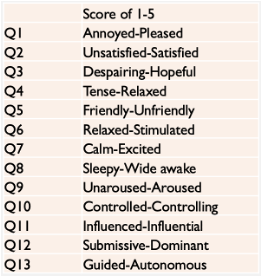
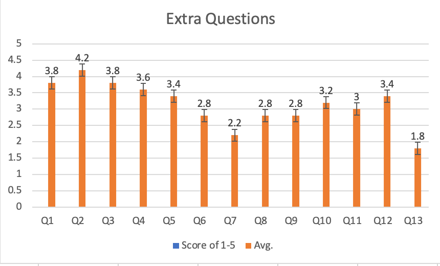
This graph shows the overall numerical averages of the set of extra Likert Scale questions I gave each user after their testing sessions were over. The scale that each question used is listed on the far left, and the numerical averages are on the right. These results are varied; notably, Question 2 has the highest average, meaning the participants felt Satisfied with the UI’s ease of navigation, and Question 13 had the lowest average, meaning the participants felt Guided as they navigated the UI prototype (likely because I kept giving them guidance and hints on where to go).
In addition to the quantitative answers I received in the Likert Scale questions, I also got much qualitative feedback from users based on their think aloud process during the testing sessions, as well as any extra feedback they gave me at the end of their sessions. There was a good mixture of positives and critiques from the end users I spoke to.
For positives, the main takeaways were: 1) that the UI was generally quick and easy to navigate through for the specific assigned tasks I gave them, as evidenced by the generally high numerical scores they gave to the Likert Scale questions, and 2) the color scheme of the app was seen as a good choice for a soothing feeling since cool colors give the sense of pain relief. One of the end users I spoke to said this after I specifically pointed it out to them, and they agreed with it.
In terms of critiques, the biggest takeaway was that the information hierarchy in some sections was not quite optimized for intuitive navigation, particularly in the Guides section. The search results being separated into different sections that they had to scroll back and forth between to see all the different results was not as quick and easy as it should have been, as evidenced by Task 4 in Figure 18 having the lowest numerical averages. In addition, some users pointed out that naming the final section the “Print” section was a bit misleading since they were just saving the PDF digitally instead of immediately printing it out from the UI. That is understandable, as the printing function was the original intent and I decided midway through making that section to retool it as a digital picture-saving section instead.
Incorporating things like swiping gestures back and forth between screens instead of just tapping, as well as a different information hierarchy (like a single page with the search results divided between tabs instead of clicking back and forth between several pages) would be good to include for the next prototype iteration. In addition, it would be good to include more already established UI patterns or frameworks to make the overall user flow and navigation more intuitive, like swiping between monthly calendars instead of just tapping small arrows on a specific portion of the screen. Frameworks like this are already commonplace because they have been proven to be effective.
Part 10: Conclusions & Next Steps
I learned a lot about the overall user research and development process throughout this whole project, as well as the varied perspectives and judgment calls that different end users can have about their ideal user experiences and designers’ UI prototypes. The feedback I got from my usability testing sessions indicated that the interface as a whole was fast and simple to navigate, but it had some questionable design decisions regarding the visual design and information hierarchy in certain sections. With the feedback I received about the Guides and Print sections for the user flow and information hierarchy, as well as general design choices like overly small text in a few areas and text being automatically entered in some places where users would expect a keyboard to pop up, I believe I have a good list of revisions to make for my next iteration of the Figma prototype. As mentioned earlier, including already established UI frameworks or functions like swiping back and forth and putting buttons in more intuitive places (e.g. a Back button could go on the top left) would also help the user flow feel smoother.
For my next steps after this, the top priority is to make edits to the prototype based on the user feedback from the usability testing sessions. After that, I would conduct a second round of usability testing sessions, likely with previous interviewees from the first round of testing, previous interviewees who I didn’t get to test the prototype with, or brand new users who have never talked to me about my project before. I would want a minimum of 12 users to test the new version of the prototype with, just to have a larger sample size and more outside perspectives.